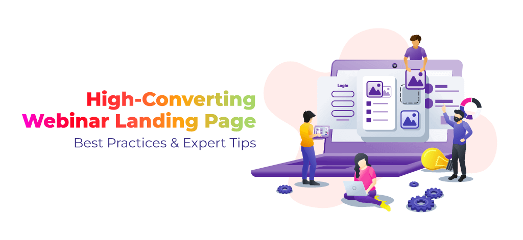
Today the world is shifting to digital solutions for marketing, sales, and promotions. Webinars are a vital tool for digital solutions. They help the organizer to engage with their audience, it can also be used in marketing and promotional strategy, etc. But if you want to reach your audience through a webinar you will have to create a webinar landing page through which you can convert your visitors into your viewers. To get an audience for a webinar it is crucial to have a killer webinar registration page.
In this blog, we will share some best practices that will help you create landing pages that convert and you will also find some additional tips that can be useful for you.
Best Practices For Webinar Landing Page
Webinar landing pages give an overview to the visitors about the webinar. If you look online you will find numerous webinar landing page examples and best practices for them, different organizers have different tips according to their landing pages. And this can be confusing especially if you are just beginning with webinar marketing. Keeping that in mind we have created a list of best practices that are simple and straightforward.

➢ Define Who Your Audience Is
The very first thing that you need to figure out is who your audience is. Before you take a step into the planning and creation process of the webinar registration page you will first have to figure out your target audience.
Sit, research, and ask yourself questions like:
Who is your target audience?
Which age group do you want to target?
What is the income of your target audience?
How can you reach your target audience?
What solution can you offer to them?
How can you make a difference in their lifestyle?
Is there any specific gender you want to target?
What are the common preferences and behaviors of your target audience?
Once you have the answer to all these questions it will become easier for you to plan and execute your webinar marketing strategy. One of the best ways to get visible in the eyes of your target audience is by using an effective search engine optimization strategy.
➢ Use Catchy Headlines To Get Users’ Attention
The next best practice that you must follow for your webinar registration page is creating catchy headlines. If you want to get more and more people to register for your webinar you will have to gain their attention. Simple, catchy, and to-the-point headlines are an effective way to grab the attention of your user. Most of the best webinar landing pages have headlines that grab the attention of users and encourage them to click. Make sure the headlines that you are using are in bold and stand out from other content on your landing page.
Use easy-to-understand language for your headlines so that your target audience can connect with you. Don’t complicate it. While creating a headline, always come up with something that is click-worthy.
➢ Create a Compelling Copy
Now after you have come up with effective and catchy headlines, the next move for you is to create a compelling copy for your webinar registration page. Just like your heading, even your copy should be concise and to the point, don’t bluff, be clear and provide all the necessary information related to your webinar.
There are various webinar landing page examples online that you can surf and take reference from. Look at what your competitors are doing and what you can do better.
Your copy should be powerful enough to convert your visitors into your customers. The main goal of creating a landing page is to motivate your visitors to take favorable action and a compelling copy can help you achieve that goal. One of the most important things to keep in mind is that your copy should not be very sale-oriented. Try not to oversell in your copy.
➢ Leverage High-Quality Images & Videos
The best webinar landing pages have high-quality visuals that can catch the attention of the user and keep them hooked. If you only have text content on your webinar registration page, your audience might find it boring. They won’t spend much time on your webinar landing page if you just have content in long paragraphs and text forms. And the last thing that you want is for your audience to feel bored.

So make sure to add high-quality images and videos to your registration page. You can share all the necessary information in the form of visuals. The color scheme of your graphics and videos should match the theme of your landing page. Using professionally designed templates can help maintain a clean and cohesive look. These templates ensure your visuals are balanced and aesthetically pleasing. It should not look out of place. Also don’t overdo with visuals on your landing page, as it will look cluttered.
➢ Have A Clear Call To Action
The key to creating the best webinar landing pages that help in converting visitors is a clear call to action. If you look online you will find all the webinar landing page templates have a clear call to action that motivates the users to take some action on the webinar registration page. Make sure your CTA is visible on the registration, it should stand out and gain the attention of the users. You can use bright colors, make it bold and you can also use an arrow to direct your users to call to action.
➢ Keep the Registration Process Simple & Clear
Your webinar landing page should be easy to navigate and the registration process should be simple and clear. By offering the simple registration you will be able to attract more attendees to your webinar. The process should have only a few essential steps, don’t complicate it, and don’t ask for irrelevant information. For the registration process ask for basic information like name, number, email address, and other necessary information. The shorter the better.
➢ Make It Mobile Friendly
The last best practice to follow for a webinar landing page is making it mobile-friendly. If you create a landing page that is not compatible with mobile devices you will lose a lot of your potential participants. The landing page that is compatible with all browsers and mobile devices will help in converting more attendees. Most people use mobile devices for their day-to-day activities online rather than desktops and computers. Also if you optimize your landing page for mobile devices it will be beneficial for the search engine optimization process.

Expert Tips For Webinar Landing Page
Here are some expert tips that can help you in creating a landing page that converts. If you follow these tips you will be able to get more leads and registrations for your webinars.
- If you want more visitors to register for your event make sure to highlight the benefits of attending your webinar. Make sure to emphasize what you are offering differently from others. And what value you can provide to your attendees.
- Adding social proof to your webinar landing pages will help in gaining the trust of new visitors. You can add testimonies of other attendees and feedback from individuals who have attended your webinar previously.
- Choose your webinar platform wisely, make sure you do proper industry research, and select webinar hosting services that align with your goals. Choose a webinar platform or service provider that helps you in creating the landing pages or a service provider that lets you customize webinar landing page templates from their library.
- The next beneficial tip that we have for you is to make sure to add a sense of urgency among your audience. By creating a sense of urgency you can trick more attendees to register for the event. Use terms like” limited offers”, “avail today”, “offer ends soon” etc.
- If you want more attendees to register for the event then make sure to optimize your landing page accordingly. Reduce the load time of your landing page. The best webinar landing pages are those that load quickly.
The Bottom Line
A webinar landing page is a crucial component of any webinar marketing strategy. This means it is crucial to have a landing page that can speak on behalf of you. The best webinar landing pages are those that provide users with all the information that they need and encourage them to take action.
In this blog, we have covered some of the best practices and tips that you can use to create an effective landing page. If you are looking for webinar services that can help you host a successful webinar with advanced tools and customization features you can book a Demo with Dreamcast.
Frequently Asked Questions
A webinar landing page should have a catchy headline, engaging copy, appealing visuals, all the necessary information about the webinar, and a clear call to action.
The most important thing in a webinar landing page is its content. The content of the webinar landing page should be easy to understand and encourage the audience to take action. It is essential to offer value to your audience through landing page content.
Some of the most popular benefits of a webinar landing page are lead generation, attracting a target audience, building trust and credibility, encouraging the audience to take action, helping in marketing the webinar, etc.
Dreamcast is a platform where you can choose to hold a webinar. The platform offers various features that help it stand out from its competitors. You can leverage features like End To End Customization, LIVE Real-Time Audience Interaction, Real-time analytics, Privacy, Security, etc.
Pick the Best Webinar Services of the Industry
