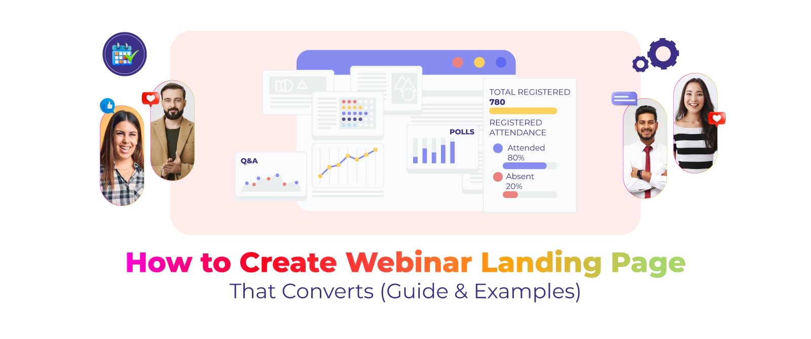
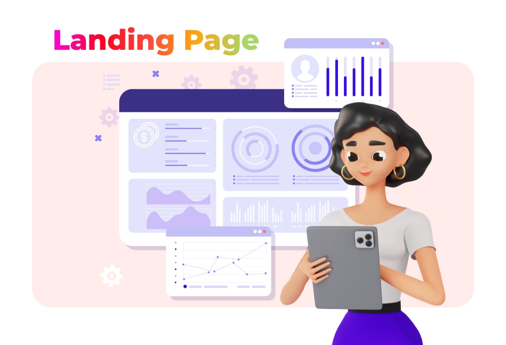
In the fast-paced world of online events, a compelling webinar landing page can make all the difference. Crafting a webinar landing page that not only attracts attention but also converts visitors into enthusiastic participants requires an informed strategy.
From understanding the key components that drive conversions to harnessing the power of persuasive design, we will equip you with insights. We will offer you the step-by-step process needed to transform your webinar landing page into a conversion powerhouse.
Why Should You Design a Landing Page for Your Webinar?
A landing page for your webinar helps provide the event’s information and value proposition. By capturing essential details such as the event date, time, topic, and speakers, a landing page ensures clear and concise communication. Additionally, it facilitates lead generation, enabling you to collect valuable attendee information for future engagement.
This dedicated space optimizes the promotion of your webinar, cultivating anticipation and interest through persuasive messaging, visuals, and countdowns. Moreover, a well-designed landing page upholds consistent branding and facilitates easy sharing across various marketing channels.
Step-by-Step Process of Creating A Webinar Landing Page
Creating a well-designed landing page for your webinar can be a daunting task and must follow a proper structure to make it successful. Here are five key steps for creating a customized, high-converting webinar landing page.
Define your target audience
If you don’t know who you are targeting, you won’t be able to reach out to people who are likely to attend your webinar. So, the first step of creating a webinar landing page is defining the target audience. Research all their pain points, challenges, and solutions your webinar is going to offer. Consider writing all the potential demographic factors that come to your mind during the research process like age range, locations, common interests, etc.
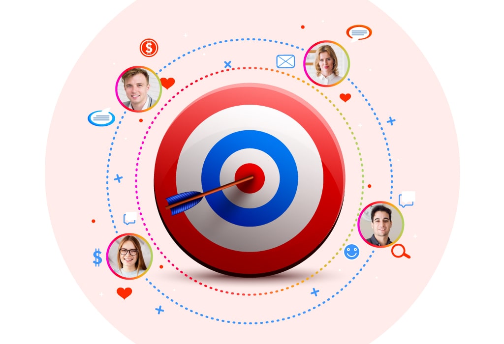
Once you’ve figured out all the demographics, your targeting would be more precise and straight to the audience who wants to join.
You can then align your SEO, advertisement, or media promotion strategy accordingly. Remember, organic promotions could take time. So, it’s always better to consider running paid ads through Facebook or Google. Paid ads give you better targeting specifications and customization to reach out to your preferred audience.
Create an engaging headline
The headline is the first thing your audience will read and get an idea of what would be your webinar is about. Headlines and subheads are the determining factors for the success of your landing page conversions.
Use a dynamic headline and create subheadings that could pull readers down the page. Your headings would play a great role in keeping readers hooked and eventually taking the needed actions.
But you might be wondering what you mean by an engaging headline or how I create one. Well, you can follow some best practices for creating your headlines compelling. For instance, you can use fancy words, and numbers, or even start with a question. Make sure to not be too salesy but rather make it clear and concise combined with the problems you’re trying to solve.
When it comes to subheaders, you want to make sure that you’re clear regarding your subject matter. This should encourage visitors to go through the complete details. Subheads help to follow a hierarchy of content, drawing the subject down the page effortlessly.
Write a quality copy that gives webinar overview
To make your webinar landing page successful, page copy will play an essential role. Focus on creating a copy that would catch the eyes of the readers once they pass the headline. Stay away from any errors or never make it sound dull, this would lose the interest of the readers. Also, avoid mentioning unnecessary information. Try to write as if you’re writing a summary. This will help you make your copy engaging.
Remember, you need to provide value to the visitors. So, add unique value propositions that answer their most important questions like what they would get out of your webinar.
Keep your messaging consistent throughout the entire page. Highlight the benefits of the webinar that can help accomplish your goal that is selling the webinar.
Add relevant social proof
You can showcase your social proof on the webinar registration page. This will enhance authenticity and make people trust what you have to offer. People are more likely to trust the word of peers, those who attended your webinars in the part, over everything.
Using testimonials that highlight the great experience of the past webinar attendees will attract new visitors to convert into attendees. As a matter of fact, Consumers will spend 31% more on businesses with “excellent” reviews. Therefore, this will help increase the attendance of your webinar.
Use images and videos
A large block of text is boring to read. You must incorporate some style and flair into the layout of your page. Teaser videos and pictures can do a lot to engage with visitors.
Now, we’re not suggesting that you overcrowd your page with images or videos. It’s best to keep landing pages simple while designing them. The images or videos you do include should, however, stand out to attract the reader in.
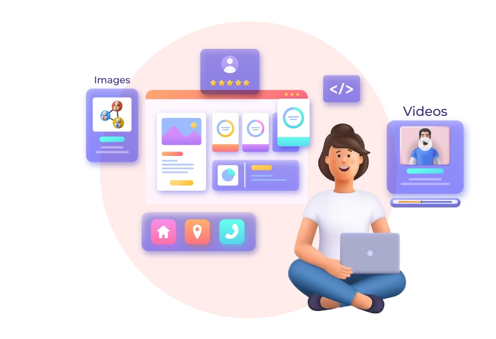
Quality always wins out over quantity in this situation. Your media should speak to the desires and requirements of your audience. A video of the presenter explaining about webinars or headshots of the speakers can also work best in establishing credibility.
Since people tend to easily digest images and video content, combining them with headlines, and copy would be an effective approach.
End with a strong call to action
Possibly the most important component of your webinar landing page is your call to action or CTA. Potential attendees can join the webinar by clicking the CTA button and responding, “Yes, I’m in!” Your click-through rate must increase if you want to do so. As a result, you must make sure that the CTA button is noticeable while not taking over the page. Design it in a way that emphasizes the rest of the content.
However, follow the best practices when creating your CTAs to gain a higher conversion rate.
- Link CTA with the opt-in form.
- Ensure that the color scheme should match the overall design of the webinar landing page.
- Always place CTA button above the fold to prevent readers to scroll down the page in order to see the button and access your registration form.
5 Design Tips for Webinar Landing Page To Win More Attendees
Speak benefits, not features
When writing landing page copy for your webinar, it’s important to focus on the benefits of attending rather than the features of your event. What is the difference? Features are actual information about your webinar, such as date, time, topic, and speakers. Benefits are what your participants will gain by joining, such as new knowledge or skills.
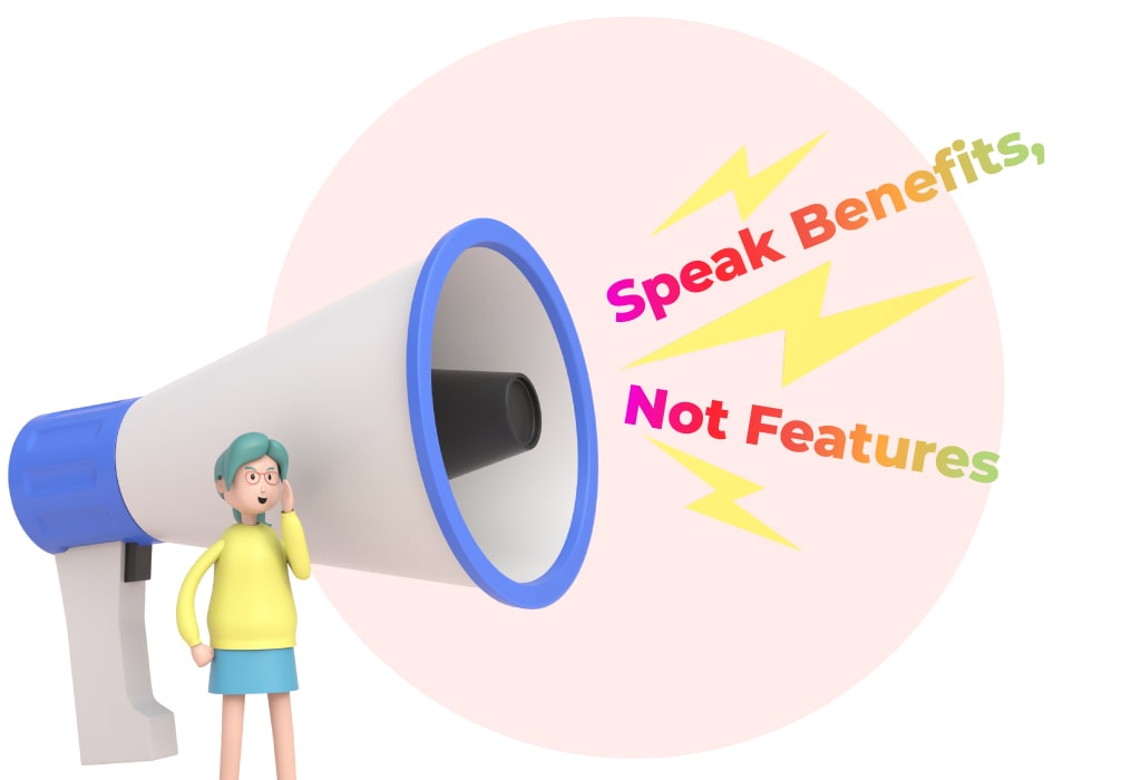
People are more likely to sign up for your webinar if they can see how it will benefit them. So when writing your page copy, be sure to focus on the benefits of webinars. For example, instead of saying “our webinar will cover topic X”, try saying something like “attendees will learn”.
Highlight collaboration with well-known personalities
Collaborating with well-known personalities can significantly enhance the effectiveness of a webinar landing page. Did you know 61% of consumers trust the product recommendations they get from influencers? So, when established and respected figures in a particular industry or field align themselves with your webinar, it lends immediate credibility and prestige to your event. These personalities bring with them their loyal followers and fan base, increasing the visibility of your webinar and expanding your potential audience reach.
People are more likely to engage with content endorsed by individuals they admire and trust, leading to higher registration rates for your webinar. Additionally, these personalities often have a wealth of experience and insights to share, which can greatly enrich the content and value of your event.
Offer extra freebies to encourage participation
Offering extra freebies as incentives can greatly enhance the effectiveness of a webinar landing page in driving participation and engagement. When potential attendees are promised valuable additional resources or perks, it creates a sense of immediate value and motivation to register. These freebies can range from exclusive downloadable content, such as e-books, templates, or guides, to limited-time access to premium tools, resources, or services.
This incentive strategy not only encourages initial sign-ups but can also drive higher attendance rates, as participants are more likely to prioritize an event when they have a vested interest in obtaining the additional freebies.
Outline webinar objectives
Outlining webinar objectives on the landing page serves as a guide for potential participants. By clearly communicating what attendees can expect to gain from attending your webinar, you set the stage for increasing overall engagement.
It helps to manage expectations, establish credibility, and demonstrate the value that your webinar will provide to participants. This transparency encourages individuals who resonate with the stated objectives to register, ensuring a more targeted and invested audience that is aligned with the goals of the event.
Create a sense of FOMO
Creating a sense of FOMO (Fear of Missing Out) on a webinar landing page can be a powerful strategy to drive registrations and increase attendee engagement. By highlighting the limited availability or time-sensitive nature of the event, you evoke a sense of urgency among potential participants.
This urgency taps into the psychological aspect of FOMO, compelling individuals to take immediate action to avoid missing out on valuable content, insights, or opportunities. Utilizing phrases like “limited seats available” or “one-time event” triggers a desire to secure a spot and be part of an exclusive experience.
Top 5 Webinar Landing Page Examples
Let’s take some examples of webinar landing pages that convert visitors into attendees.
Hootsuite
Why it works:
- The webinar landing page captures the reader’s interest in the topic by asking a question. The questions hint at what to expect during the webinar.
- Bullets are used to display the learning objectives of the webinar. Hootsuite uses compelling sales pitch and high-energy words.
- Speaker bios are added to the homepage to give authority to the webinar.
- Readers get a clear CTA – “Share this” with social sharing buttons to encourage them to spread the word about the event.
What could be better
- A different image choice could work better here. It could be more descriptive by using A/B testing.
- The webinar landing page is missing social proof to make it even more trusted for visitors.
- The page has a lengthy signup form with a lot of questions that registrants might not want to answer. The signup form has to be simple to gain more attendees.
IBM
Why it works
- This page makes good use of a countdown timer to build anticipation for the event.
- The body text speaks to what motivates the target audience.
- The text is written in an active voice.
- Clearly mentioned bio of the speakers to establish expertise.
- Body text starts above the fold, making you more likely to scroll down and read the rest.
What could be better
- There are eleven form fields, which will frustrate many people.
- Text and design are too dry, and not interesting.
- Titles are too long and use complicated language.
- You must scroll to see the CTA.
Slack
Why it works
- The page contains short and sweet copy with the use of bullet points.
- The body speaks directly to the target audience, clearly stating who should watch the webinar and what they’ll learn.
- A good balance of colors that speaks to the brand image.
- An informal writing style with the use of active voice.
- The purple CTA fits perfectly against the white background.
What could be better
- There’s no information about the speakers.
- The CTA is at the bottom of the page.
- There are too many form fields.
- The CTA text is too generic.
HubSpot
Why it works
- The color palette matches the brand perfectly and the logos are displayed prominently.
- The image of guest speakers at the top of the page feels inviting and welcoming.
- The body signifies the audience’s motivations and tells them what they will learn from the event.
- The body of the text is short and concise.
- There is a second CTA placed after the scroll.
- Form fields are kept to a minimum.
What could be better
- The CTA is plain text, instead of a colorful button that sticks out.
- The CTA text isn’t distinctive enough.
SEMrush
Why it works
- The headline of this webinar landing page tells the reader exactly what the webinar will be about and includes two benefits that the audience stands to gain from watching.
- Listed date, time and language ensures reader understand immediately when they will attend
- Photos give the reader an instant personal connection to the webinar speakers.
- Using a minimalist format, the reader isn’t overwhelmed and the page looks clean and sleek.
What could be better
- There’s not a lot for interested viewers to learn about. There are a lot of questions that go unanswered.
- The body copy could be improved by listing who the webinar is for.
- The CTA for this webinar landing page could be stronger. While “Register” is a simple CTA, it could be improved with more urgency.
FAQs on Webinar Landing Page
An effective webinar landing page should include a clear and compelling headline, concise event description, date and time details, and information about the speakers. It also provides key benefits, a registration form, visuals (such as images or videos), and a strong call-to-action button that guides visitors to register.
Keep your registration form simple, asking for essential information such as name and email address. Minimize friction by avoiding excessive fields. Consider using social proof elements like the number of registrants to boost confidence in your event.
Utilize various marketing channels such as social media, email campaigns, your website, and partnerships with relevant influencers or organizations. Create engaging content that highlights the value of your webinar and encourages people to visit your landing page.