
Planning an event is no small task. You spend weeks, sometimes months, organizing speakers, booking venues, managing registrations, and making sure everything runs smoothly. But once the event ends, the real work begins. You need to figure out what actually happened. Was it successful? Did people enjoy it? Were the sessions useful? Did the tech work properly? You need solid information, actionable feedback, and the right tools to collect and analyze both. That’s where event data analysis comes in.
There are two primary methods for gathering event insights: utilizing event analytics dashboards and conducting post-event surveys. These methods are widely used in modern event tech solutions. They help organizers measure success, identify problems, and plan better events in the future.
But they are not the same. They give you different types of information. Some are fast and visual. Others are slower but more emotional. So which one gives deeper insights? Let’s take a closer look.
What is an Event Analytics Dashboard
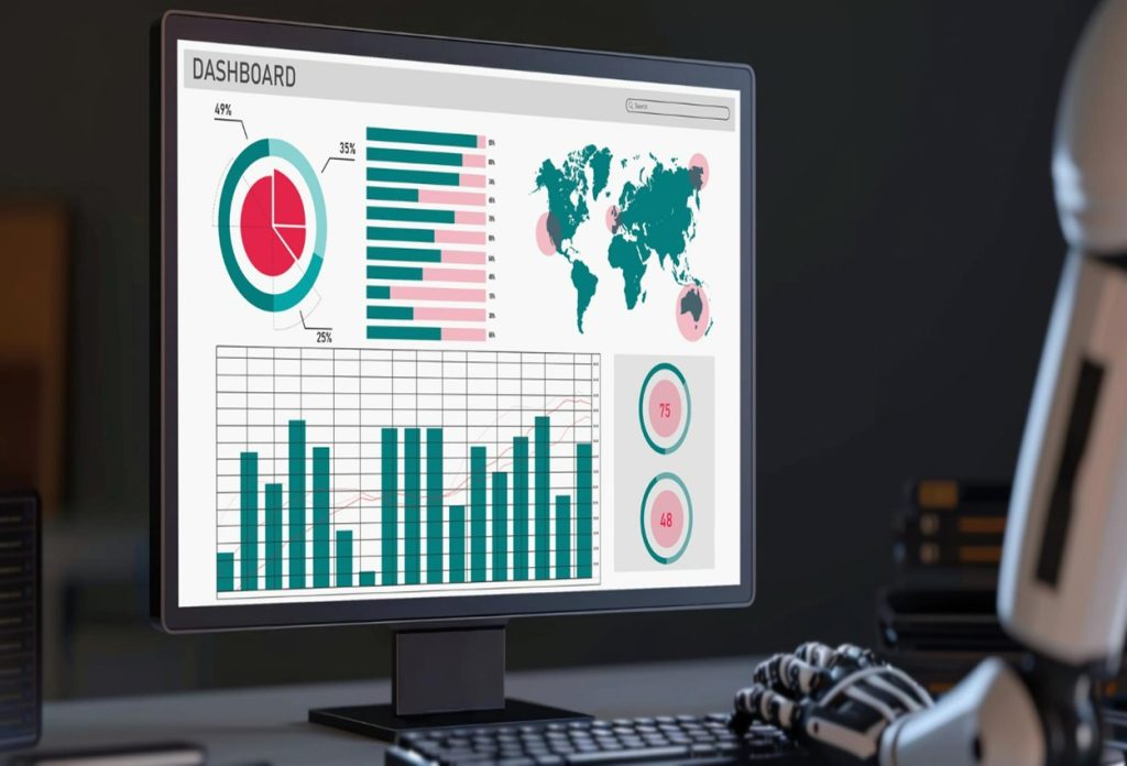
An event analytics dashboard is a digital tool that collects and displays data from your event. It pulls numbers from different sources such as event registration platforms, mobile event apps, social media, ticketing systems, and more. Then it organizes that data into charts, graphs, and tables so you can see what’s going on.
These dashboards are part of many event tech solutions. They are designed to give you fast access to your data, often in real time. That means you don’t have to wait until the event is over to start analyzing.
You can track attendance, engagement, session popularity, app usage, and even social media mentions. It’s all there, laid out in a way that is easy to understand. You get a clear picture of how your event performed from a technical and operational point of view.
Pros of Event Analytics Dashboards
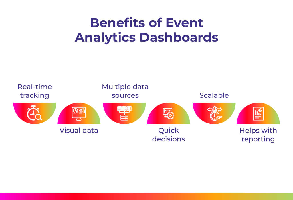
- Real-time tracking: One of the biggest advantages is that you can see what’s happening while the event is still going. If a session is half empty or people are leaving early, you will know right away. That gives you a chance to adjust things on the spot.
- Visual data: Dashboards use graphs, heat maps, and charts to show data. That makes it easier to spot trends and patterns. You don’t have to dig through spreadsheets or raw numbers.
- Multiple data sources: You are not limited to one type of data. You get information from check-ins, app interactions, social media, and more. That gives you a broader view of how your event performed.
- Quick decisions: Because the data is live, you can make fast decisions. If something is not working, you can fix it before the event ends.
- Scalable: Whether you are hosting a small workshop or a large conference, the dashboard can handle it. It adjusts to your event size and complexity.
- Helps with reporting: You can export the data and share it with your team or stakeholders. That makes post-event reporting easier and more professional.
Cons of Event Analytics Dashboards
- Lacks emotional feedback: Dashboards show numbers. They don’t show feelings. For example, you might know that 85% of attendees stayed for the closing session, but you won’t know if they found it boring or inspiring.
- Needs setup: You have to connect all your platforms before the event. That takes time and planning. If you forget to link something, you might miss important data.
- Can be expensive: Some event tech solutions charge a premium for advanced analytics. Smaller teams or budget-conscious organizers might find it hard to afford.
- Too much data: If you are not sure what to look for, the dashboard can be overwhelming. You might end up staring at graphs without knowing what they mean.
- Limited context: You can see what happened, but not why it happened. That is a big gap when you are trying to improve future events.
Related Blog:- How To Use Event Data Analytics To Measure And Improve Your Events
What is a Post-Event Survey
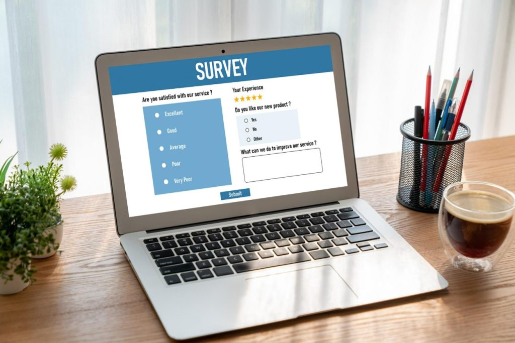
A post-event survey is a set of questions you send to attendees after the event. It is a way to collect event feedback directly from the people who were there. You ask them what they liked, what they didn’t, and what could be improved. Surveys are usually sent by email or through event apps. They can be short and simple or long and detailed. It depends on what you want to learn.
Unlike dashboards, surveys give you emotional and subjective feedback. They tell you how people felt, not just what they did. That kind of information is important when you are trying to understand the full experience.
Pros of Post-Event Surveys
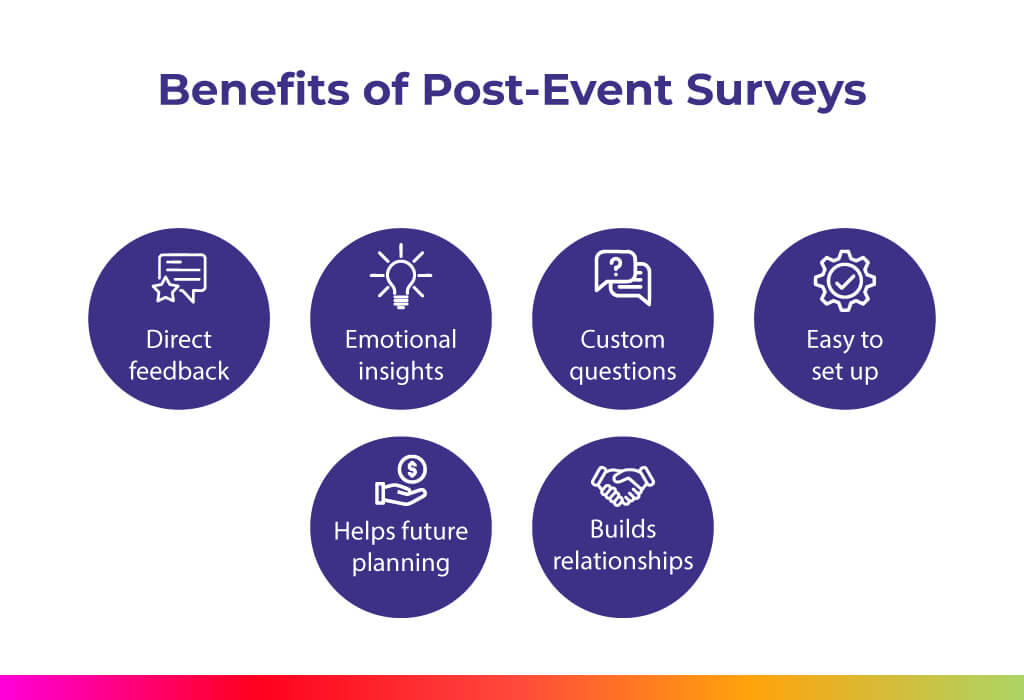
- Direct feedback: You hear straight from the attendees. They tell you what worked and what didn’t. That kind of feedback is valuable.
- Emotional insights: Surveys help you understand how people feel. Did they enjoy the sessions? Was the venue comfortable? Did they feel welcomed? These are things dashboards can’t show.
- Custom questions: You can ask anything. Want to know if the food was good? Ask. Want to know if the speakers were engaging? Ask. You control the questions.
- Easy to set up: You don’t need fancy tools. Just write your questions and send them out. Most event platforms, such as Dreamcast, have built-in survey features.
- Helps future planning: Attendee feedback can guide your next event. You will know what to keep, what to change, and what to avoid.
- Builds relationships: Asking for feedback shows that you care. It helps build trust with your audience and makes them feel valued.
Cons of Post-Event Surveys
- Low response rates: Not everyone fills out surveys. You might only hear from a small group. That can limit your insights.
- Delayed results: You have to wait for people to respond. That means you don’t get instant feedback.
- Biased feedback: People with strong opinions (positive or negative) are more likely to respond. That can skew your results.
- Limited data: Surveys don’t show behavior. You won’t know how long someone stayed or which sessions they skipped.
- Manual analysis: You have to read and sort through answers. That takes time and effort. It’s not as fast as looking at a dashboard.
- Depends on the wording; If your questions aren’t clear, you might get confusing answers. That can make the feedback less useful.
Related Blog: How to Use WhatsApp For Post-Event Feedback?
Event Analytics Dashboards Vs. Post-Event Surveys
| Aspect | Event Analytics Dashboards | Post-Event Surveys |
| Type of Data | Quantitative (numbers, stats, behavior patterns) | Qualitative (opinions, emotions, experiences) |
| Data Collection | Automatic, pulled from multiple event tech solutions | Manual, based on attendee responses |
| Speed of Insights | Real-time or immediate | Delayed (after attendees respond) |
| Depth of Insights | Shows what happened (attendance, engagement, drop-off rates) | Explains why it happened (satisfaction, preferences, pain points) |
| Ease of Use | Requires setup, integration with tools, and some data skills | Easy to create and send; minimal setup |
| Scalability | Works for events of any size (small workshops to large conferences) | Works for any event size, but response rates vary |
| Cost | Can be expensive, especially with advanced event tech solutions | Usually low-cost or built into event platforms |
| Bias/Accuracy | Highly accurate behavioral data, but lacks context | Prone to bias (low response rates, extreme opinions are more likely to respond) |
| Best For | Tracking metrics like check-ins, session popularity, app usage, and social media engagement | Understanding attendee experience, satisfaction, and improvement suggestions |
| Limitations | Lacks emotional insight; overwhelming if too much data; requires setup | No behavioral tracking; delayed responses; depends on question clarity |
| Ideal Use Case | Mid-event monitoring, real-time adjustments, operational decision-making | Post-event reflection, attendee satisfaction measurement, and future planning |
Which Option Provides Better Insights and Why?
So which one gives you deeper event insights?
Well, it depends on what you’re trying to learn. If you want to know what happened- how many people came, which sessions were popular, how long they stayed- then event analytics dashboards are better. They give you hard data. You can track behavior and see patterns. That is useful for understanding the event from a technical and operational point of view.
But if you want to know why something happened or how people felt about it, then post-event surveys are better. They give you opinions, emotions, and suggestions. That is useful for understanding the human side of the event.
So the real answer is: you need both.
Event data analysis works best when you combine numbers with feedback. Dashboards tell you what happened. Surveys tell you why it happened. Together, they give you a full picture.
For example, if your dashboard shows that people left early, your survey might tell you it was because the last session was too long. Or if your dashboard shows high engagement on the app, your survey might reveal that people loved the interactive features.
Using both tools helps you make smarter decisions. You can improve your content, fix problems, and plan better events in the future.
It is not about choosing one over the other. It is about using both in a smart way. That is how you get the most out of your event tech solutions.
Final Word
Event feedback collection is not just a task. It is a way to learn and grow. Whether you use event analytics dashboards or post-event surveys, the goal is the same: to understand your event and make it better.
Dashboards give you fast, clear data. Surveys give you deep, personal feedback. One shows behavior. The other shows feelings.
You don’t have to choose one over the other. The best event tech solutions combine both. That way, you get the full story.
So next time you plan an event, don’t stop at just numbers or just opinions. Use both. Your attendees will thank you. And your next event will be even better.
If you are serious about improving your events, then combining event analytics with post-event surveys is the smartest move. You will get the facts, the feelings, and the full picture. And that is what leads to real improvement.